The Situation
The numbers were there. The understanding wasn't.
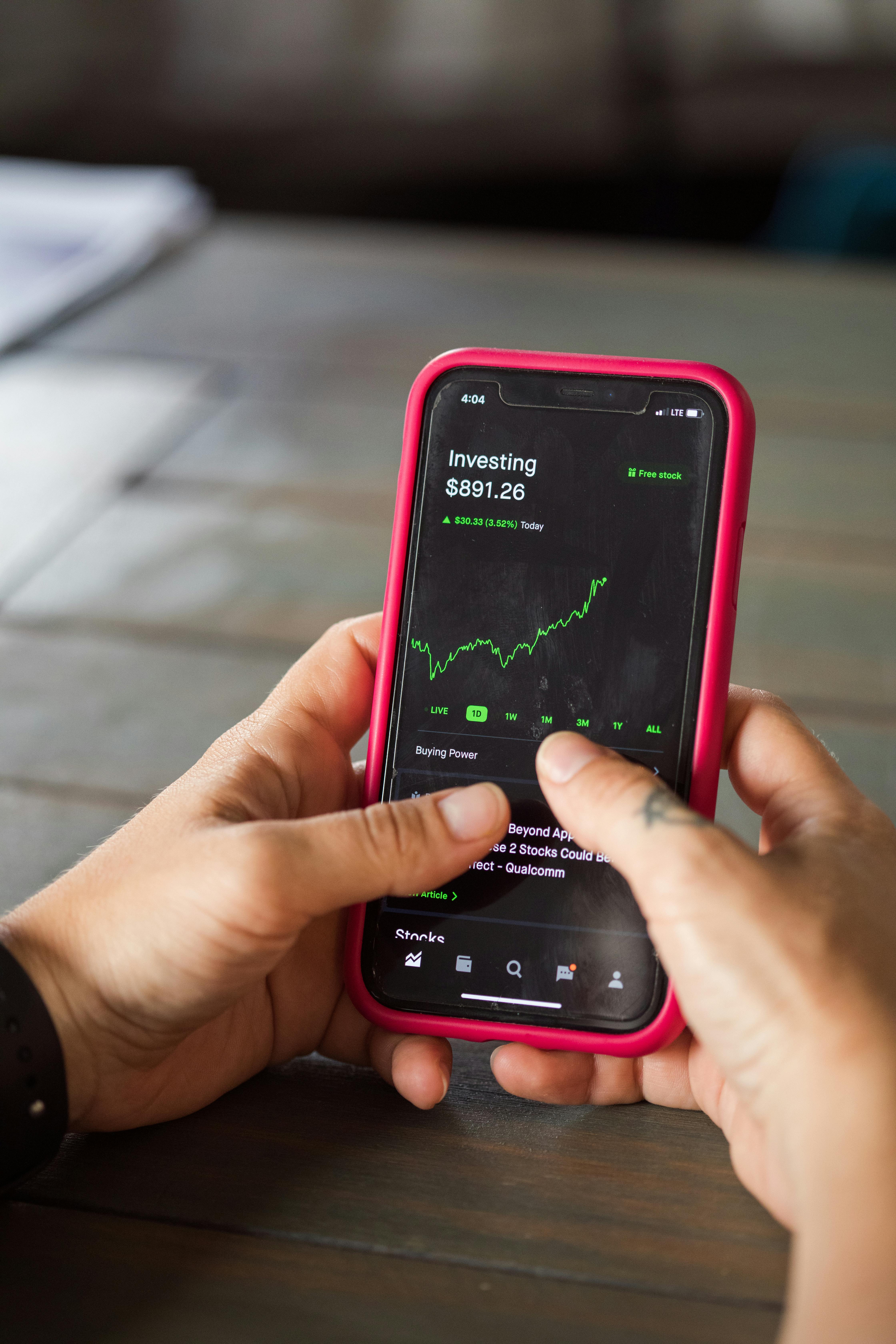
An online investment platform had a clearly stated purpose: help users feel in control of their finances. The dashboard was central to that promise — the place investors came to check in, track progress, and stay confident in their decisions.
But annual satisfaction surveys told a different story. Year after year, a consistent theme emerged: investors didn't understand what they were looking at. Returns were unclear. Fees were invisible. Long-term goals had no visible home. And without anything to benchmark against, users had no way to know whether their portfolio was performing well or poorly in the context of the broader market.
The dashboard wasn't failing because it lacked data. It was failing because it lacked context. As the embedded UX researcher on the product team, my role was to get to the root of that disconnect — and turn the findings into a redesign that built genuine trust with investors.
Research Approach
Start with alignment inside. Then go get the truth from users.
Before going to users, the team needed a shared understanding of what was actually on the dashboard and what they believed users cared about. Assumptions had accumulated over time — features added without a coherent view of the whole. That had to be addressed first.
Content Inventory + Internal Card Sorting Workshop
A full audit of every element on the current dashboard — what was shown, where it lived, and what it was meant to communicate. This was followed by an internal card sorting workshop with stakeholders, mapping dashboard elements to hypothesized user priorities. The goal wasn't to get the right answer from the room — it was to surface the team's assumptions so they could be tested. Creating alignment within the product team first meant everyone went into user research with the same questions, not different agendas.
In-Depth User Interviews + Card Sorting
In-depth interviews with a range of investors — from those just starting out to more experienced portfolio holders. Each session included a card sorting exercise: participants organized dashboard elements by what they'd want to see first, what mattered most, and what felt confusing or irrelevant. This combination was deliberate — interviews surfaced the language, expectations, and anxieties investors brought to their dashboard; card sorting turned those conversations into structured, comparable data about information hierarchy and priority.
"The team had strong opinions about what investors cared about. The card sorting told us those opinions and the users' actual priorities weren't in the same order."
Key Findings
Four things the dashboard was failing to do — and users knew it, even if they couldn't name it.
The research made one thing clear: the platform wasn't short on data. It was short on meaning. Investors weren't disengaged because they didn't care — they were disengaged because the dashboard gave them no reliable way to interpret what they were seeing.
Unclear Returns — Numbers Without Context
Users couldn't confidently tell if they were gaining or losing money. Raw numbers — a balance, a percentage — meant little without context. Was a 4% return good? Bad? Average? Without a way to interpret what they were seeing, investors defaulted to uncertainty. The dashboard was showing them data but not helping them understand it.
Opaque Fees — Hidden Costs Undermining Trust
Many investors were unaware of how much they were paying in service fees — or how those fees were calculated. When users discovered fees they hadn't understood, it didn't just create confusion; it created distrust. The platform charged fair, competitive fees. But invisible fees don't feel fair — they feel hidden. Transparency here wasn't a nice-to-have; it was foundational to the relationship the dashboard was supposed to build.
Goal Tracking Gaps — No Way to Measure Progress
Investors came to the platform with long-term goals — retirement savings, a house purchase, financial independence. The dashboard had no simple way to reflect whether they were on track to meet those goals. Without that, every check-in was disconnected from the reason they were investing in the first place. The portfolio existed in isolation from the future it was supposed to be building toward.
No Performance Benchmarking — No Way to Know "Is This Good?"
Without comparisons to market benchmarks — the S&P 500, for example — users had no reference point for assessing their portfolio's performance. A portfolio that returned 6% in a year could feel like a success or a disappointment depending on what the market did. Without that context, users couldn't make that judgment. The dashboard was asking them to evaluate their investments in a vacuum.
What Changed
One dashboard that serves two very different moments — the daily check-in and the long view.
The research pointed to a fundamental tension in what investors needed: sometimes they wanted to know how things were going right now. Other times, they needed to zoom out and see if they were still on track toward a goal years away. A single, static layout couldn't serve both needs well.
Working closely with design and product, we moved away from a one-size-fits-all approach. The new dashboard introduced a flexible dual-view structure — giving investors the ability to toggle between what mattered to them in the moment.
Everyday Performance
Designed for the investor checking in on a regular basis — focused on the present and recent past.
Long-Term Progress
Designed for the investor checking in on their goals — focused on trajectory and the future they're building toward.
The toggle between views gave investors agency — not more complexity, but more control over which lens they used to understand their money on any given day.
The Outcome
Investors came back more often — and left with fewer questions.
Following the redesign, the new dashboard drove a 35% improvement in engagement within the first month. But the more meaningful signal was qualitative: the nature of user feedback shifted. Instead of questions about what numbers meant, investors began commenting on how much clearer things felt.
The dual-view structure didn't add complexity — it removed it. By giving users a clear choice between two purposeful views, the redesign eliminated the cognitive work of trying to extract both short-term performance and long-term progress from a single, undifferentiated layout.
Complex financial data doesn't have to feel complex to users. When the information is framed around what someone is actually trying to understand, it becomes approachable — and that approachability is what trust is built from.
Results
35%
increase in dashboard engagement in the first month after launch
4
user trust gaps identified and directly addressed in the redesign
2
purposeful dashboard views — one for daily performance, one for long-term progress