The Situation
Good assumptions. Untested in the one place that counted.
A retail team was rolling out a new flow for applying promotional discounts at checkout — a brand new operation that staff had never encountered before. The design had been thoughtfully built around two reasonable assumptions about what would work best for in-store staff.
The design assumptions
Both assumptions were reasonable. Neither had been tested in a real-world setting — with real staff, real customers, and the pressure of a live transaction. That gap between design intent and floor reality was exactly what needed to be tested before launch.
Research Approach
Two methods — because a controlled test alone wouldn't be enough.
The research was designed to evaluate the flow at two levels: how it performed in a structured test, and how it held up under the uncontrolled conditions of an actual customer interaction. Both were necessary.
In-Store Usability Testing
Hands-on usability sessions with seven staff members who regularly processed checkouts. Participants worked through the new promotions flow in a controlled setting — allowing close observation of where they hesitated, what they missed, and what confused them. The controlled environment made it possible to isolate specific friction points without the noise of a live customer interaction.
Live Transaction Observation
Observing staff during actual customer transactions — watching the flow in real time, under real pressure. A customer asking "how much did I save?" mid-transaction creates a different kind of pressure than a usability scenario. Live observation revealed how the gaps identified in testing compounded when staff couldn't pause, when customers were waiting, and when confidence under pressure was what the experience actually demanded.
"A clean design is tested by whether it works in a usability lab. A great design is tested by whether it works when a customer is standing at the register asking a question you weren't prepared for."
Key Findings
Four gaps between what the flow assumed and how staff actually worked.
The combination of usability testing and live observation surfaced four specific mismatches between the design's assumptions and staff's established habits and real-time needs. None of these would have surfaced through design review alone.
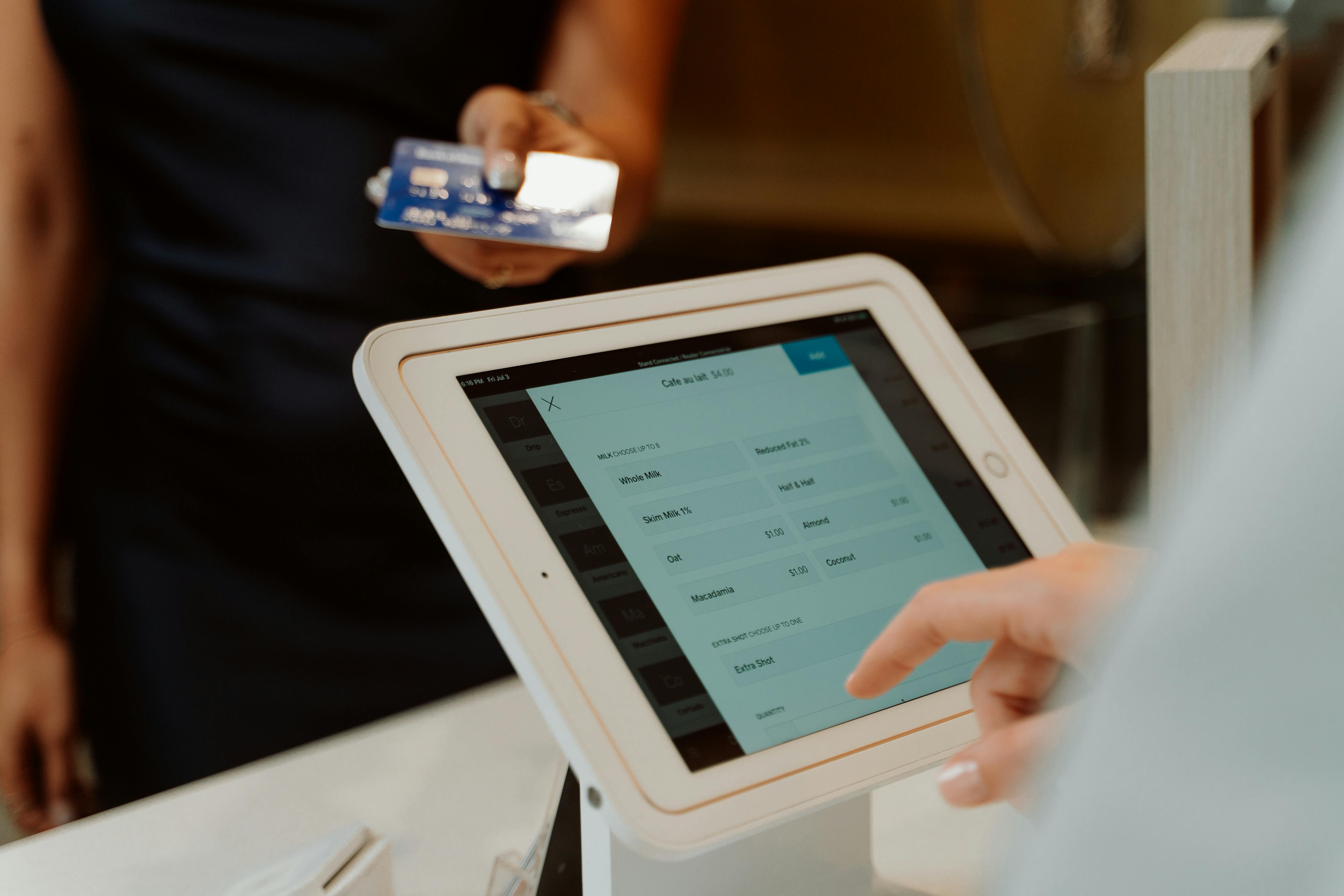
Savings Information Was Buried
Staff had an established habit of telling customers their total savings when handing over the receipt — a small moment that reinforced the value of the transaction. The new flow placed savings information in an area that was difficult to find quickly. Mid-transaction, with a customer waiting, staff couldn't locate it fast enough — and the moment was lost.
Order Confirmation Showed No Breakdown
The order confirmation page displayed a total but no itemized savings breakdown. When customers asked "which items were discounted?" — a common and reasonable question — staff had no quick answer available on screen. The information existed somewhere in the system; it just wasn't where staff needed it, when they needed it.
Promotion Icons Were Unrecognizable
Promotions were represented by icons that staff hadn't encountered before and couldn't immediately interpret. Which items were discounted? When did the promotion end? The icons that were meant to communicate this quickly were instead creating a moment of confusion — exactly when clarity was most critical.
Promotion Details Required Too Many Steps
When customers asked about specific promotions, staff needed to look up the details. The flow required more clicks than the situation allowed — adding time to the transaction and increasing visible hesitation on the staff side. In live observation, this played out as staff searching, customers noticing the pause, and the confidence dynamic of the transaction shifting.
What Changed
Four targeted fixes. No redesign — just alignment with how staff actually work.
Working closely with the design and product teams, each finding was translated into a specific adjustment. The goal wasn't to overhaul the flow — the goal was to close the gap between how it had been designed and how it needed to perform on the floor.
Savings displayed prominently at point of transaction — Total savings surfaced where staff could see and communicate it immediately — without searching. The moment of telling a customer how much they saved became effortless again, preserving a small but meaningful staff ritual that the original design had inadvertently removed.
Itemized savings breakdown added to order confirmation — Total savings and a per-item breakdown were added to the confirmation page. Staff could now answer "which item was discounted and by how much?" with a glance — turning a previously uncertain moment into a confident one.
Promotional icons replaced with clear, recognizable symbols — The abstract icons were replaced with intuitive visual cues that staff could read at a glance — communicating which items were discounted, what type of promotion applied, and when it ended. Recognition replaced confusion.
Promotion lookup streamlined to fewer clicks — Staff could access promotion details faster, reducing transaction pauses when customers asked specific questions. The flow now matched the speed at which staff needed to retrieve information during a live interaction.
The Outcome
Confident staff. Seamless launch. Zero disruption to checkout workflows.
Following the adjustments, the promotions flow integrated seamlessly into daily operations. Staff were able to communicate savings confidently, address promotional questions without hesitation, and maintain the rhythm of their existing checkout workflows — all without the hesitation and improvisation that the original flow would have required.
The deeper lesson: even well-intentioned design assumptions don't survive first contact with a real transaction unchanged. Testing with staff before launch — in the actual context where the design has to perform — is what made the difference between a flow that looked right and one that worked right.
Results
4
critical gaps identified and fixed before the flow reached a single customer
7
staff members tested — usability sessions and live transactions — before launch
0
workflow disruptions at launch — staff handled promotions confidently from day one